July 24, 2015 By: Rahul Samaddar
This is the first sequel of my blog post throwing light on the concept and requirements of Usability Testing in the recent web and mobile apps world. You must be wondering “when” “who” & “how” this test is conducted. Here’s you will have answers to all your queries.
When to Conduct Usability Test?

Ideally, usability tests should start during the design phase of the application because it directly affects the design of the app. Although we should keep the usability criteria throughout the development phases so that there are no usability errors.
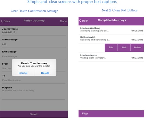
Our Mileage app is developed to ensure simplicity at each phase even at the time of displaying validation messages. The messaging is clear enough to direct users in running the app.
Who Performs Usability Testing?
It can be done as an internal process between designers, developers and testers. They all can sit together, analyse the system and come up with the results or guidelines that need to be followed during the development.
But the much effective and advanced way to do it is hiring an actual user or conducting a survey among a group of users and collecting their feedback on its ease of use & simplicity.
Real-time users are capable of providing interesting feedback such as:
- Overall experience – Interesting or boring?
- Ease of Use – Simple or Confusing?
- Performance – Quick or Slow
- Would they like to use it again?
- Any issues?
- Suggestions & Feedback, if any?
How to Conduct Usability Test?
Usability testing is like another software testing that validates the product against the requirements. The uniqueness, in this case, is that the software needs to be validated by the user or the way the user would like to see it. Although there are multiple ways to conduct this test but we bring forth to you some of the commonly used ways in the industry:
- During the design phase of your application, you may use any wireframe tool to generate your application flow video, or just draw all the screens with the flow on paper and discuss its feasibility within the team.
- By validating the application designs/screens against some usability standards like:
- Easy to navigate.
- Labels and button texts are clear and concise.
- UI elements provide visual feedback when pressed.
- Present users with a confirmation option when deleting.
- Speak the user’s language not technical.
- A clear and consistent way to go back on every screen.
- Colors used to provide good readability.
- Icons should be clear to understand.
Here’s a look at the standardized Mileage app covering major concerns.

- Another very effective method to perform the usability test is to hire real-time users to work on the site and log results or feedbacks. In this process, you can shoot a video when a real user is interacting with the application that can be analysed by the development team.
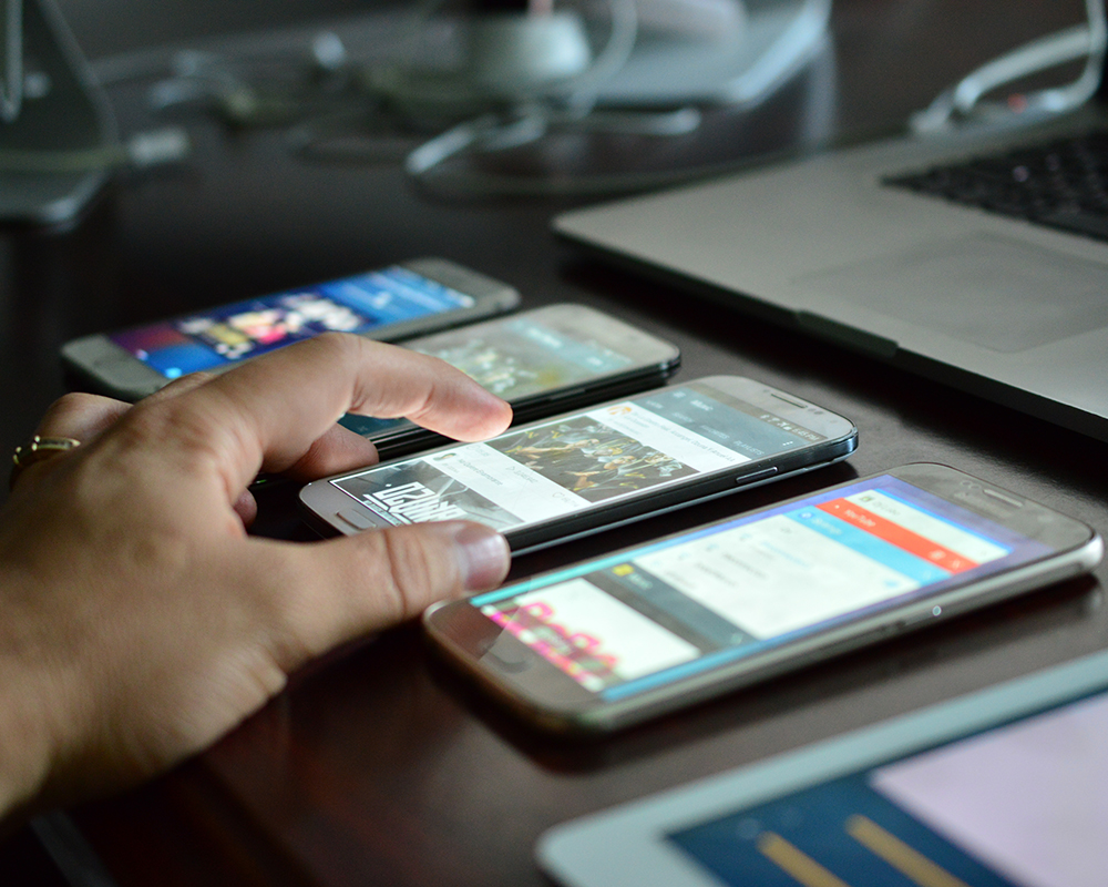
- In the case of the web there are multiple screen recorder software available but for mobiles, an external camera is being used for recording that can also provide you the finger-footage which is very crucial for mobile app.
- Use of tools or external evaluators that accept wireframes and designs of your application and provide feedback or statistical report for your application. There are multiple free and paid applications are available in the market for this kind of testing.
Developers can select emulators of their choice and use it for popular smart devices like iPhone, Samsung, etc. Emulators allow you to understand how the application is going to look in an actual device.
There are many other tools available in the market that can be utilized in usability testing. Few of them are categorized below:
- Provide users or you can pick your own user. You can submit your page/design and the tasks to be performed. The tool in turn will provide you the videos of the user interaction and the user’s comments. You can make your own analysis. Some tools for your review:
- OpenHallWay
- UserTesting
- Some of the tools use tracking methods that can analyse the time spent by the user on your application or mobile site. It captures minute details like mouse clicks, average time spent on-page.
- Tools that provide you with feedback based on the application, or wireframe that you submit as input. Some tools of this type also provide surveys that help in giving conclusive evidence regarding usability issues. These tools can also recruit users for your usability test. Using such tools you can upload design/wireframes with a set of questions. As a result, you will get all responses with highlighted areas and pictorial representation too. These kinds of result sets are very useful from an analysis perspective. Some tools for your review:
I’m sure the examples and comparison with the Mileage app have really helped you in understanding the implementation of Usability Testing and you would be keen to note down the approach & the essence of the same in my next release.


